Hospital interior design
Published: 12/16/21

Four prominent Hawke’s Bay landscapes feature in the interior design of the Kaweka Hospital.
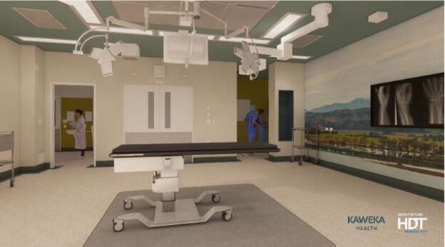
The Kaweka Ranges, Te Mata Peak, Mount Kahuranaki and the Ruahine Ranges are the inspiration for the operating theatre imagery – symbolising how the stunning mountain ranges encircle our region, embracing the land and sea.
This evokes the aspirations of Kaweka Hospital to protect and care for patients under its professional care.
Tracey Thompson-Gray is part of the architectural design team at HDT that designed the building and its interior.
Tracey said the overall design influence is the Kaweka Ranges and its natural attributes – the strength of the mountain ranges, the protective canopy of the forest and openness of the Heretaunga Plains have created a new health campus set in landscaped surroundings to create a welcoming and restful environment.
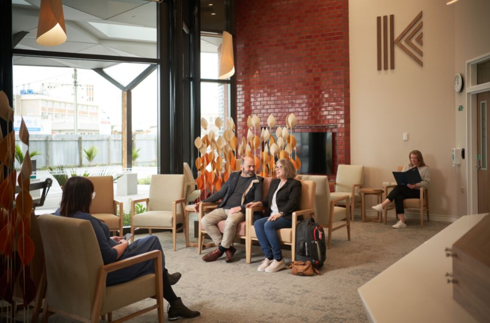
The prominent feature of the building exterior is the use of red bricks with a stylised relief pattern of the Kaweka ranges creating texture on the façade. The solidity of the brick wraps into the reception area symbolising the strength of the mountain ranges.
“As this is a private hospital we want the patients to arrive and feel like they can relax and have confidence that they’re in the safe hands of highly capable medical professionals.
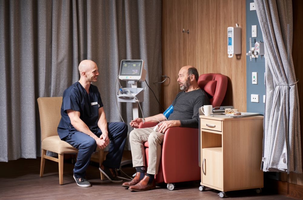
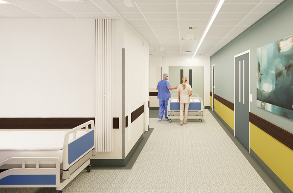
“We want to create a quiet, calming and relaxing environment for the patient in the reception and recovery areas. We are using materials with a feeling of warmth and nature; timber panelling and neutral fabrics with splashes of colour. Further inside the facility, whilst still focussing on the clinical aspects such as hygiene and durability we have introduced colour to enhance the working environments.
“We are using colours and materials that are not fashion colours but will stand the test of time”
Tracey adds that as well as a positive and caring atmosphere for patients, there also needs to be considerations for staff, especially when it comes to break time.
“The staff lounge is a respite area for staff and it needs to enable the team to feel as if they are away from the intensive work areas within the facility. The subtle warm white grey of the walls and the textures of the fabrics help make the space feel less clinical and more inviting to take a break in.


